

e44: The Detective
- R Cipolletta

- Feb 26, 2021
- 3 min read
Body of Work 05.12.20
Case N. 0

Supporting Piece:

Notes on Development:
For this piece, I moved onto testing out Nigel's recommended technique of painting directly in colour to avoid reliance on black and white shading. It is noteworthy that before I even knew of his technique, I had already drawn and shaded a sketched version of this canvas in my original monotonous style, but was quick to turn that whole layer off to fully commit to the technique.
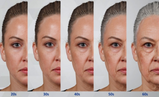
Maybe an interesting note: To help build up my tone palette with a suitable range of colour temperatures, I used the eyedropper tool to sample shades from an image of my mother, who I felt had the perfect skin complexion for my racially ambiguous character. I made a swatch palate for easy access to the range, which I first tested on the line-up shot as a warm up.
Another interesting factoid: when drawing the eyelashes, I used the above-listed image of a doe's lashes as reference, resulting in a thicker and straighter/down-turning set than you'd ordinarily see in humans. I thought this would draw an interesting parallel, especially when in contrast with the sharp red gleam hidden in the irises that was placed to represent her bloodlust against the cervids. I'm a fan of meta, psychological introspective, what can I say.
My main feedback for Nigel's technique was that, despite ultimately having to go back to black and white for the darker shading and 'gritty' textures I like, it created a massive improvement in depth and realism. Whereas before I was brute-forcing my work with higher intensity blacks, for this piece I was able to economise and save them for detailing. In another, hypothetical, version of this piece where I had chosen to omit Nigel's suggestions, the strands of the eyelashes, hair and eyebrows would not have stood out as sharply against the sheer amount of intense black that would have been haphazardly peppered around. Adding to this, I would have ended up using much flatter levels of tone - with every pore having to be in the same shade (and therefore depth) as every shadow, due to my perceived lack of options.

A great example of this is the included image (right) of some alterations that Nigel quickly made to her eyes during our last tutorial. Here you can see that the right eye (unedited) lacked a lot of depth and realism because it was the one element of her face which I had accidentally neglected to apply his technique to and had shaded purely with blacks and whites. The right one, by contrast, makes use of a range of colour to show this depth and is, indubitably, creating a massive positive difference. With this approach, her right eye feels dynamic, and alive, something which does not come across in the other. The results are significantly better!
While I don't have the time to invest in fixing this up per Nigel's suggestion, I wanted to include this image for reference and to show off a microcosmic example of the radical improvement my work has seen, even if it still has a way to go.
Despite everything, this is my best portrait for sure!
Image References:


DEVELOPMENT CATALOGUE:
[Please see bellow videos documenting the entire process of creating this piece: from concept, to sketch, to painting, and rendering.]
Note: due to an unknown issue with the software, all time-lapse videos have a slight colour distortion, sometimes appearing darker and a much higher saturation than what the canvas truly looked like at the time. My apologies for any inconvenience this may cause.
- R Cipolletta


Comments